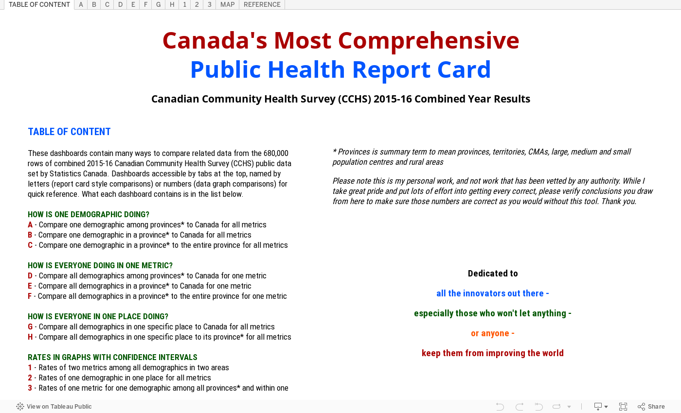
Canada's Most Comprehensive Public Health Report Card (2015-16 Combined CCHS)
Results for the combined years 2015-16 Canadian Community Health Survey (CCHS) were released in early November, 2017... all of about 680,000 lines of it! It combined results from the individual years of 2015 and 2016 to allow for a larger sample so one could get statistically reliable results for geographies smaller than the provincial level. This was what is really useful and practical about it, for knowing where to focus to address public health issues that it can help with, since the problem is probably not an even distribution throughout a province.
The following set of interactive, report card style dashboards on Tableau bring out the most telling information from the survey, which is comparisons to the national and provincial averages in each year. You can embed these dashboards into websites allowing for JavaScript below, like I did below, by clicking on the Share icon (third right in from bottom right), or send as a link. The embedding actually carries the variable values at whatever they were set at on the view you had when you grabbed the JavaScript. That means you can leave the desired view on your blog and talk about it, rather than make every reader change the parameters so they can see what you were seeing when you wrote about it! Lovely feature!
In these report cards, immediate visual results comparing rates are shown as dots.
Hovering over any dot will show you the numbers behind the stats, including:

As for order or variables, metrics are listed vertically where they appear. Metrics are grouped by similarity of other metrics starting at the top with:
Geography is shown left to right starting with BC on the west coast, and going to NL on the east coast just like a map, with territories, different sized population centres, Census Metropolitan Areas (CMAs) and rural areas (see bullets following paragraph). These will be called jurisdictions. Within a jurisdiction, namely provinces and territories, several geographic categorizations of sub-jurisdictions were available. They were grouped in the order below, going left to right, with geographies within each category (like different health zones) being in alphabetical order:
Demographics were ordered as follows:
Due to the number of dashboards that show similar variables and results in different ways, naming each dashboard with something short was not practical for lack of description, and length that would not fit at the top as tabs. As a result, I named the dashboards by letters and numbers, listing in the Table of Content below, with explanations for each. If you use some frequently in referencing these dashboards, just remember the letters and/or numbers you want.
Below is a walk through of each dashboard and what they show.
In this report card, one can quickly see lots of red dots vertically for medium sized population centres (30-100k), and the provinces of NL and NS, indicating poor performance in many categories among all those surveyed (12+ years old of both genders). The results for NS and NL are not surprising as it's a provincial situation seen in single year report cards. The medium sized population centres, though, are a shock. They have nothing that is better than the national average! And a whole whack of scores that are worse! That's the cumulative of all these population centres from coast, to coast, to coast! I don't know what it is about them but that's worth asking some experts about to see what they think! The small urban population centres at least have some community belonging going for them, while the rural areas have relative lack of stress in their lives as well. But those medium sized centres... wow!
On the side of doing well, the province of BC, CMAs and large population centres (many of which are CMAs), lead the way. BC is stereotypically thought of as being relatively healthy, and the stats confirm that. Those in large cities and population centres are probably doing better than average due to youth in the cities, some healthier lifestyles like with gyms, run groups, etc. that would be more prevalent, better choices of food more conveniently available by convenience of many and big stores, as well as economically with cheaper prices. But I'm speculating. The results don't tell causality. They just show facts to pose questions for people to answer... but at least people are aware of them.
Scanning across a metric might show you if any jurisdiction or two might be skewing the data, if there were an imbalance of red to green dots. Not nearly as interesting as the vertical clusters but possibly insightful for some things.
Change demographics and see what patterns might emerge for some.
The default jurisdiction is CMAs, with all the CMAs in the CCHS data lined up for comparison. We are comparing everybody in the survey (both genders, 12+ years old). From Dashboard A, we saw CMAs did relatively well to the rest of the nation, so we would expect an imbalance of more green to red dots. However, CMAs are also in provinces and contribute to the provincial values so relatively bad provincial values would hint at similar contributions from its CMAs. So let's take a look and see what we could quickly tell.
The CMAs are shown west to east of Canada from left to right on the graph. The ones in BC, not surprisingly, did well because it had the best of both worlds, CMAs and a healthy BC. Calgary is doing quite well, too. Continuing left to right, we see the area of Mamawetan/ Keewatin/ Athabasca in SK didn't do too well. Next is Greater Sudbury that has ZERO metrics where it's better than the national average, though it's one fewer (9 to 10) negative indicators than Mamawetan/ Keewatin/ Athabasca. I'll leave it to you to speculate on what plausible reasons why these CMAs are doing relatively poor compared to the rest of the country. To be fair to ON CMAs, though, Ottawa and Toronto did relatively well. Finally, moving through QC and the Atlantic Provinces, the latter of which generally had poor provincial report cards, we see their CMAs aren't doing all that bad. It's all the less populated places that contributes most of their negative results.
You can check Dashboard C below to see which sub-jurisdictions within a jurisdiction, might be contributing most to the full jurisdiction results.
Looking horizontally at the dashboard above as shown by default, ON CMAs seems to have a problem with mood disorders, with many being lower than the national average. That'd be really interesting to know why! That's a mental health thing, which seems their healthcare providers don't include because they have higher than the national average for having a healthcare provider. Anyone want to explain to me why?
This is place to see which sub-jurisdictions within a jurisdiction might be contributing most to its overall results. Sub-jurisdictions are NOT equal to each other, but you can probably get an intuitive sense from the visual weights if some jurisdictions are overwhelming better or worse compared to the jurisdiction average.
In the dashboard above, we are looking at ON. As you can see at the left, all the places below CMA or Large population centres are doing terribly relatively to the provincial average to which they contribute. So the gap to CMAs are even larger because those smaller places contribute to the provincial average rather than being independent of it. Not surprisingly from what we saw in Dashboard B, Greater Sudbury has relatively bad results. On the other hand, Ottawa is glowing in how well it is doing. Things our nation's capital is well in terms of health, compared to Ontario, indeed!
For the Heavy Drinking metric chosen by default, you can see Quebecers can brag about doing more heavy drinking (5+ drinks in one occasion for men, 4+ for women), on at least one occasion each month in the past year! Newfoundlanders were a close second by comparison, The territories are also interesting in that NT has about the same degree of heavy drinking as NL, but the YK and NU territories are pretty much neutral to the national average. That would be interesting to know why! But from this dashboard, if anybody who brags about heavy drinking in their province and they were not in QC and NL, you can generally dismiss them as exaggerating. :)
BC and ON residents, generally, did the least heavy drinking among provinces, by a clear shot. However, even they didn't compare to the big cities of CMAs and large population centres (100k+). Almost every demographic in CMAs and large population centres drank heavily less than the national average by a statistically significant amount, and no demographics drank heavily at a higher rate, by a significant amount as well. Almost to the exact contrary, people in small population centres (under 30k) and in rural areas, drank heavily more often than the national average. Striking!
As for demographics regardless of geography, there was no real trend to be found. It's pretty much a geographical phenomenon!
Change the metric to see if you can see other sweeping trends for any other metrics.

Here, we look at smoking in QC. They have a worse rate (i.e. higher) than the national average. It seems a little worse among Males 65+ and Females 18-34, because the opposite gender did not have a worse than national rate, but the gender specified was enough to skew the entire age demographic. The population centres less than large were also worse off than the large population centres, not surprisingly from what we saw before about their relative health comparisons.
Among health regions, though, there were some striking differences. The Région de l'Outaouais was worse than the national rate for about half the demographics! Meanwhile, Qubec City and the Région de la Capitale-Nationale have multiple demographics doing better than the national average, without any worse than the national average. Interestingly, the large city of Montreal had a few demographics worse than the national average, with none better, when big cities tend to do better than the national average. Montreal is a unique city with its bilingual cultural mix that may have something to do with that outcome.
For Sense of Community Belonging that is Somewhat or Very Strong in Newfoundland, it's generally pretty well spread out. In other words, few areas or demographics really skew the provincial results, with all the grey dots seen. Certainly, no age group is enough to skew the provincial results. It's the rural areas that have a higher rate, where you generally hear people talk about how everybody knows everybody. Meanwhile, the city of St John's, being a city, has a little less of that. However, if you were to check with Dashboard B above, in the default setting, you'll see that St. John's is still doing better than the national average. NL is very communal, it would seem, as they claim and as the image they have in the eyes of many.
Change geographies to see if other places have similar or opposite effects to NL here, and what else you might be able to see for other metrics.
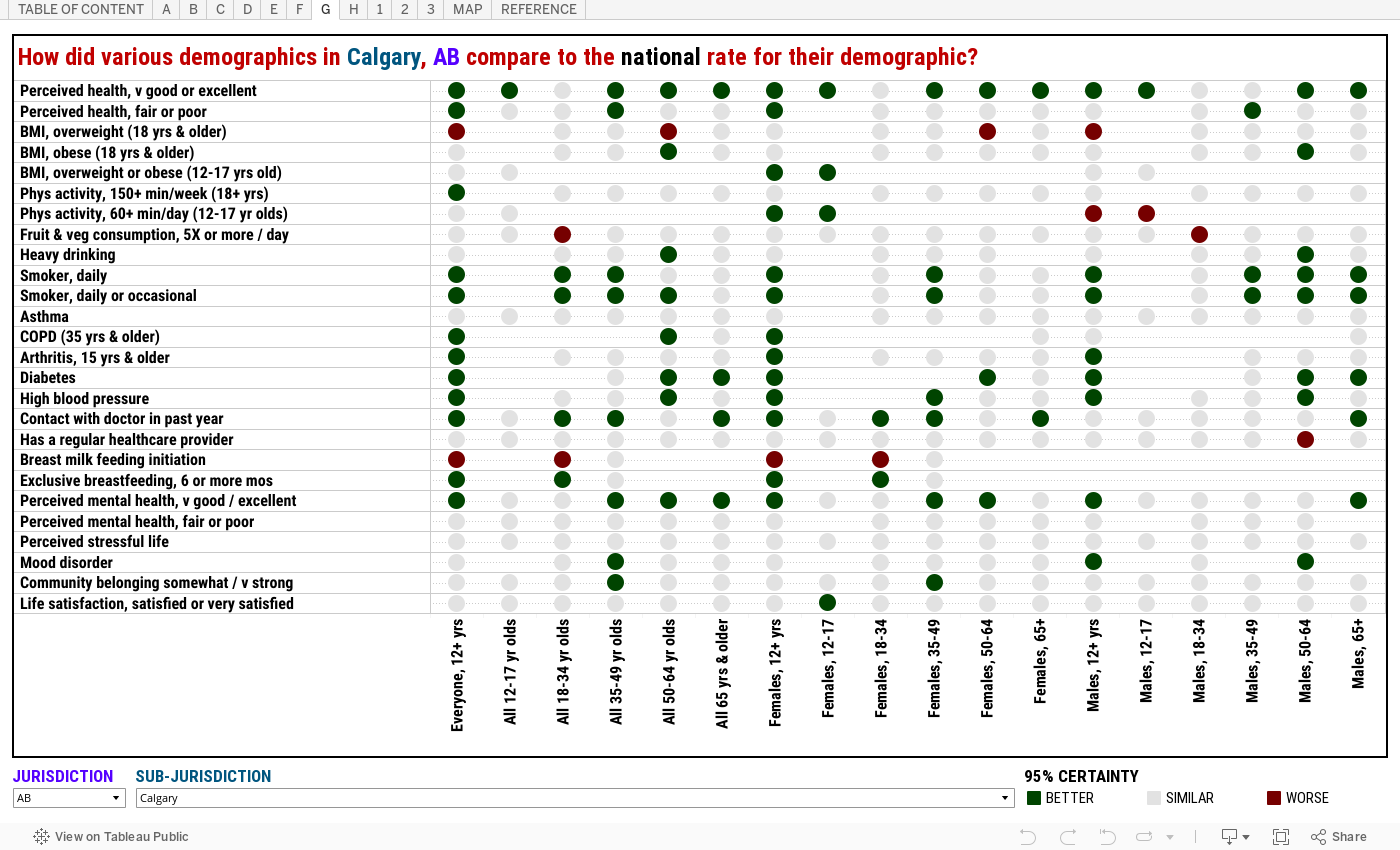
We look at Calgary, AB, here which had been stated in Dashboard B as being very well off, relatively speaking. A lot of demographics contribute to Calgary's overall good results, but it can be seen that females contribute a little more than males by counting green dots. Not terribly exciting, perhaps, but I was trying to spread the defaults for these dashboards to encompass some geographical diversity. Find some health region that may have very good or bad results relative from the national average, in Dashboard B or F, for example, and see if it turns up a more mixed bag of results.
Please note that with this dashboard, due to the sub-jurisdiction being associated with a jurisdiction, as you change one of the two menus, you will get a blank dashboard before you finish changing the other. That's because as far as Tableau is concerned, there is no such place such as Calgary, NS, for example, if you were to change the province first in getting to results for Halifax, NS. Results will appear again after you have changed both menus.
For this dashboard, we are looking at rural areas in MB in comparison to the entire province. It's a pretty clear and simple picture, really. Generally challenged with obesity for adults 18 years and older, with no particular age group being significantly worse than others, for the most part. However, their state of mental health, lacking in mood disorders and feeling a strong sense of community belonging are better than the provincial average. Interestingly, there was no significant difference for perceived life stress compared to the rest of the province. That said, Manitoba is mostly rural so it may be that the rural scores influenced the provincial score more than that of any other geographical area.
Like with Dashboard G, due to the sub-jurisdiction being associated with a jurisdiction, as you change one of the two menus, you will get a blank dashboard before you finish changing the other, although every jurisdiction has a rural area menu choice so changing jurisdiction first will still give you a dashboard, from this instance (or CMA, large, medium and small population centres, for most jurisdictions).
You can choose whatever values you like, along with a high low range represented by the dotted line. However, he idea was that you'd compare the same metric among two provinces, then set the high and low range to be equal or identical reference lines in both graphs, to see which demographics stand out, or how rates generally compared numerically, rather than the report cards that only showed the results in terms of dots. Values were present if you hovered your pointer over the dots, but you'd only be able see one result at a time, unlike these "rates" dashboards.
This dashboard gives a view of the relative difference among rates for all the metrics. It just shows which rates are high, and which are low, which can be useful for related topics like smoking, asthma and COPD, but it is not meant to imply causality.
It is a combined look at a jurisdiction as a whole, with its sub-jurisdictions. Looking at male smokers, notice the incredibly high rates in the territories! As for sub-jurisdictions in NB, not much really stood out. The confidence intervals are big enough that it's hard to say from this that there were much in terms of significant differences. That's why those report card style dashboards are so useful!
In terms of having a regular healthcare provider, which is not the same as a regular doctor (a question that used to be asked in that format), the Atlantic provinces and Ontario are above the national average. Otherwise, QC is noticeably below the average, while NT and NU are doing horribly.
The following set of interactive, report card style dashboards on Tableau bring out the most telling information from the survey, which is comparisons to the national and provincial averages in each year. You can embed these dashboards into websites allowing for JavaScript below, like I did below, by clicking on the Share icon (third right in from bottom right), or send as a link. The embedding actually carries the variable values at whatever they were set at on the view you had when you grabbed the JavaScript. That means you can leave the desired view on your blog and talk about it, rather than make every reader change the parameters so they can see what you were seeing when you wrote about it! Lovely feature!
In these report cards, immediate visual results comparing rates are shown as dots.
- Green dots mean (statistically) significantly better* results than the national or provincial average (depending on what the dashboard is comparing);
- Grey dots mean no statistical significance when compared to the national or provincial average;
- Red dots mean (statistically) significantly worse* results than the national or provincial average;
- No dot means no statistically reliable data.
Better or worse already have context interpreted into them so that, assuming statistical significance, a score greater than the national average for something like diabetes will appear in red, while a greater score for sufficient physical activity is good. Higher rates of diabetes are not desirable, whereas higher rates of people exercising are. The only questionable judgment call is that for having seen a physician in the past year. While one may interpret higher rates of this as having a sicker population, which would be true for number of overall visits, higher rates is interpreted as being good because one is supposed to see a physician once a year for check-ups. It is interpreted as the ability to be able to see a physician in the past year, not causes of illness for needing to see one. If you don't agree, just reverse the colour of the dot you see for it if it were red or green. Grey dots or lack of dots has no distinguishing comparative meaning.
Hovering over any dot will show you the numbers behind the stats, including:
- Rate;
- High and low confidence intervals;
- # people affected according to the rate;
- High and low confidence intervals of people affected;
- What is being compared for clarification.
Among the variables of demographics (age and gender combined), geography and metrics, each dashboard shows two variables held constant, while one is able to be changed for the "report card" dashboards. The "rates" dashboards, meanwhile, has only one axis for a variable, so you have to choose values for two variables while the axis variable is constant. These "rates" dashboards show actual results with confidence intervals for those interested in the numeric rather than comparative results. Finally, a reference dashboard has definitions and methodology notes, among other notes.
As for order or variables, metrics are listed vertically where they appear. Metrics are grouped by similarity of other metrics starting at the top with:
- Overall physical health;
- BMI and physical activity;
- Other lifestyle choices like fruit & vegetable consumption, drinking, and smoking;
- Chronic diseases starting with lung ones next to smoking, like asthma, COPD, before other ones like diabetes and high blood pressure;
- Two related to having and seeing physicians;
- Breast milk initiation and feeding;
- Mental health related metrics;
- Concluding with overall life satisfaction.
Geography is shown left to right starting with BC on the west coast, and going to NL on the east coast just like a map, with territories, different sized population centres, Census Metropolitan Areas (CMAs) and rural areas (see bullets following paragraph). These will be called jurisdictions. Within a jurisdiction, namely provinces and territories, several geographic categorizations of sub-jurisdictions were available. They were grouped in the order below, going left to right, with geographies within each category (like different health zones) being in alphabetical order:
- ALL (provincial result to include all geographies);
- Large, medium, small population centres (all areas qualifying into each, definitions for each population centre size in the GEO and CMA worksheets in the Reference tab shown above);
- Rural areas (all areas qualifying combined);
- CMAs within the province;
- Health "districts" (zones, units, etc.) within the province.
Demographics were ordered as follows:
- Both genders and their age groups;
- Females and their age groups,
- Males with their age groups.
Due to the number of dashboards that show similar variables and results in different ways, naming each dashboard with something short was not practical for lack of description, and length that would not fit at the top as tabs. As a result, I named the dashboards by letters and numbers, listing in the Table of Content below, with explanations for each. If you use some frequently in referencing these dashboards, just remember the letters and/or numbers you want.
Below is a walk through of each dashboard and what they show.
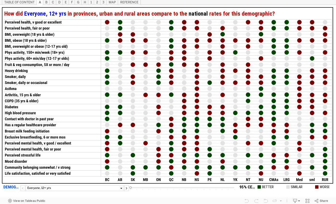
A
This shows how one demographic is doing across the jurisdictions for all the indicators.
In this report card, one can quickly see lots of red dots vertically for medium sized population centres (30-100k), and the provinces of NL and NS, indicating poor performance in many categories among all those surveyed (12+ years old of both genders). The results for NS and NL are not surprising as it's a provincial situation seen in single year report cards. The medium sized population centres, though, are a shock. They have nothing that is better than the national average! And a whole whack of scores that are worse! That's the cumulative of all these population centres from coast, to coast, to coast! I don't know what it is about them but that's worth asking some experts about to see what they think! The small urban population centres at least have some community belonging going for them, while the rural areas have relative lack of stress in their lives as well. But those medium sized centres... wow!
On the side of doing well, the province of BC, CMAs and large population centres (many of which are CMAs), lead the way. BC is stereotypically thought of as being relatively healthy, and the stats confirm that. Those in large cities and population centres are probably doing better than average due to youth in the cities, some healthier lifestyles like with gyms, run groups, etc. that would be more prevalent, better choices of food more conveniently available by convenience of many and big stores, as well as economically with cheaper prices. But I'm speculating. The results don't tell causality. They just show facts to pose questions for people to answer... but at least people are aware of them.
Scanning across a metric might show you if any jurisdiction or two might be skewing the data, if there were an imbalance of red to green dots. Not nearly as interesting as the vertical clusters but possibly insightful for some things.
Change demographics and see what patterns might emerge for some.
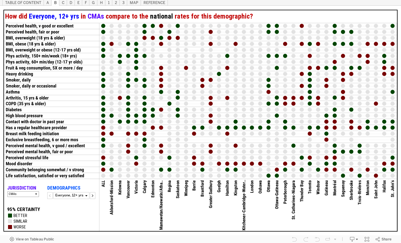
B
This shows how one demographic is doing across the sub-jurisdictions within one jurisdiction, compared to the national average, for all the indicators.
The default jurisdiction is CMAs, with all the CMAs in the CCHS data lined up for comparison. We are comparing everybody in the survey (both genders, 12+ years old). From Dashboard A, we saw CMAs did relatively well to the rest of the nation, so we would expect an imbalance of more green to red dots. However, CMAs are also in provinces and contribute to the provincial values so relatively bad provincial values would hint at similar contributions from its CMAs. So let's take a look and see what we could quickly tell.
The CMAs are shown west to east of Canada from left to right on the graph. The ones in BC, not surprisingly, did well because it had the best of both worlds, CMAs and a healthy BC. Calgary is doing quite well, too. Continuing left to right, we see the area of Mamawetan/ Keewatin/ Athabasca in SK didn't do too well. Next is Greater Sudbury that has ZERO metrics where it's better than the national average, though it's one fewer (9 to 10) negative indicators than Mamawetan/ Keewatin/ Athabasca. I'll leave it to you to speculate on what plausible reasons why these CMAs are doing relatively poor compared to the rest of the country. To be fair to ON CMAs, though, Ottawa and Toronto did relatively well. Finally, moving through QC and the Atlantic Provinces, the latter of which generally had poor provincial report cards, we see their CMAs aren't doing all that bad. It's all the less populated places that contributes most of their negative results.
You can check Dashboard C below to see which sub-jurisdictions within a jurisdiction, might be contributing most to the full jurisdiction results.
Looking horizontally at the dashboard above as shown by default, ON CMAs seems to have a problem with mood disorders, with many being lower than the national average. That'd be really interesting to know why! That's a mental health thing, which seems their healthcare providers don't include because they have higher than the national average for having a healthcare provider. Anyone want to explain to me why?
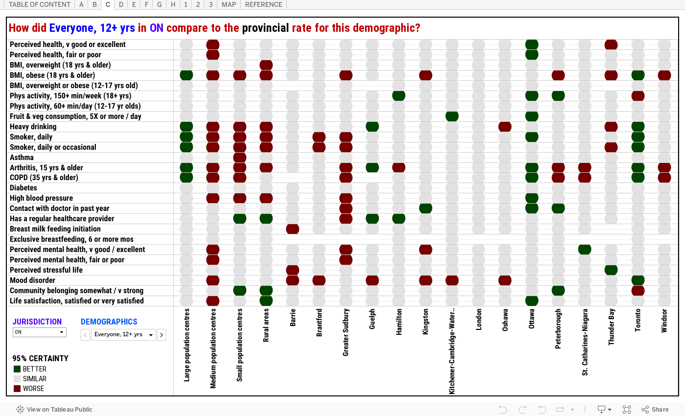
C
This shows how one demographic is doing across the sub-jurisdictions within one jurisdiction, to the jurisdiction average, for all the indicators. It's basically Dashboard B with jurisdictional average comparisons rather than the national average comparisons.
This is place to see which sub-jurisdictions within a jurisdiction might be contributing most to its overall results. Sub-jurisdictions are NOT equal to each other, but you can probably get an intuitive sense from the visual weights if some jurisdictions are overwhelming better or worse compared to the jurisdiction average.
In the dashboard above, we are looking at ON. As you can see at the left, all the places below CMA or Large population centres are doing terribly relatively to the provincial average to which they contribute. So the gap to CMAs are even larger because those smaller places contribute to the provincial average rather than being independent of it. Not surprisingly from what we saw in Dashboard B, Greater Sudbury has relatively bad results. On the other hand, Ottawa is glowing in how well it is doing. Things our nation's capital is well in terms of health, compared to Ontario, indeed!
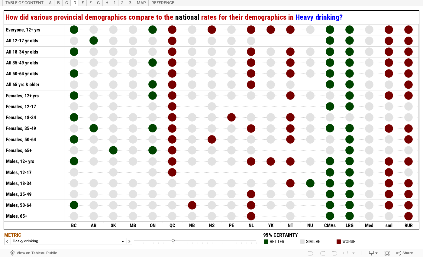
D
This shows which demographic/s in which jurisdiction/s are doing well, or not, compared to the national average, for the given metric chosen.
For the Heavy Drinking metric chosen by default, you can see Quebecers can brag about doing more heavy drinking (5+ drinks in one occasion for men, 4+ for women), on at least one occasion each month in the past year! Newfoundlanders were a close second by comparison, The territories are also interesting in that NT has about the same degree of heavy drinking as NL, but the YK and NU territories are pretty much neutral to the national average. That would be interesting to know why! But from this dashboard, if anybody who brags about heavy drinking in their province and they were not in QC and NL, you can generally dismiss them as exaggerating. :)
BC and ON residents, generally, did the least heavy drinking among provinces, by a clear shot. However, even they didn't compare to the big cities of CMAs and large population centres (100k+). Almost every demographic in CMAs and large population centres drank heavily less than the national average by a statistically significant amount, and no demographics drank heavily at a higher rate, by a significant amount as well. Almost to the exact contrary, people in small population centres (under 30k) and in rural areas, drank heavily more often than the national average. Striking!
As for demographics regardless of geography, there was no real trend to be found. It's pretty much a geographical phenomenon!
Change the metric to see if you can see other sweeping trends for any other metrics.
E
This shows how all demographics within all the sub-jurisdictions within one jurisdiction, compared to the national average, for all the indicators.
Here, we look at smoking in QC. They have a worse rate (i.e. higher) than the national average. It seems a little worse among Males 65+ and Females 18-34, because the opposite gender did not have a worse than national rate, but the gender specified was enough to skew the entire age demographic. The population centres less than large were also worse off than the large population centres, not surprisingly from what we saw before about their relative health comparisons.
Among health regions, though, there were some striking differences. The Région de l'Outaouais was worse than the national rate for about half the demographics! Meanwhile, Qubec City and the Région de la Capitale-Nationale have multiple demographics doing better than the national average, without any worse than the national average. Interestingly, the large city of Montreal had a few demographics worse than the national average, with none better, when big cities tend to do better than the national average. Montreal is a unique city with its bilingual cultural mix that may have something to do with that outcome.
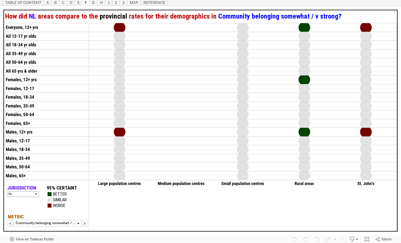
F
This shows how all the demographics within the sub-jurisdictions within one jurisdiction, compared to the jurisdictional average, for all the indicators. It's Dashboard E with jurisdictional instead of national rate comparisons.
For Sense of Community Belonging that is Somewhat or Very Strong in Newfoundland, it's generally pretty well spread out. In other words, few areas or demographics really skew the provincial results, with all the grey dots seen. Certainly, no age group is enough to skew the provincial results. It's the rural areas that have a higher rate, where you generally hear people talk about how everybody knows everybody. Meanwhile, the city of St John's, being a city, has a little less of that. However, if you were to check with Dashboard B above, in the default setting, you'll see that St. John's is still doing better than the national average. NL is very communal, it would seem, as they claim and as the image they have in the eyes of many.
Change geographies to see if other places have similar or opposite effects to NL here, and what else you might be able to see for other metrics.
G
This dashboard compared demographics in one sub-jurisdiction to the national rate for all metrics. This is Dashboard A at a sub-jurisdiction level of geography.
Please note that with this dashboard, due to the sub-jurisdiction being associated with a jurisdiction, as you change one of the two menus, you will get a blank dashboard before you finish changing the other. That's because as far as Tableau is concerned, there is no such place such as Calgary, NS, for example, if you were to change the province first in getting to results for Halifax, NS. Results will appear again after you have changed both menus.
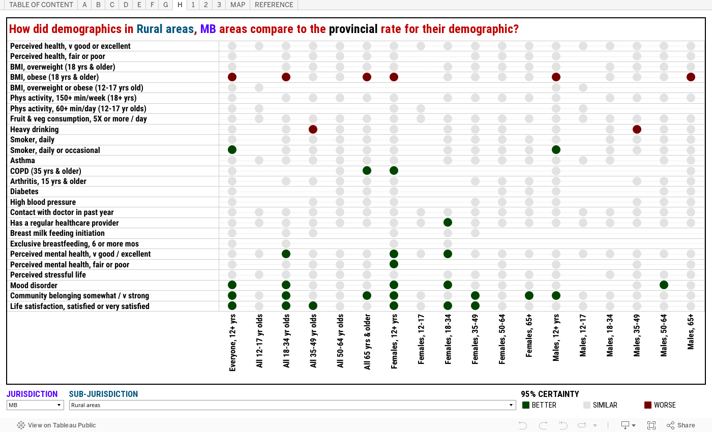
H
This dashboard compared demographics in one sub-jurisdiction to the provincial rate for all metrics. This is Dashboard G with jurisdictional rather than national results for comparison.
For this dashboard, we are looking at rural areas in MB in comparison to the entire province. It's a pretty clear and simple picture, really. Generally challenged with obesity for adults 18 years and older, with no particular age group being significantly worse than others, for the most part. However, their state of mental health, lacking in mood disorders and feeling a strong sense of community belonging are better than the provincial average. Interestingly, there was no significant difference for perceived life stress compared to the rest of the province. That said, Manitoba is mostly rural so it may be that the rural scores influenced the provincial score more than that of any other geographical area.
Like with Dashboard G, due to the sub-jurisdiction being associated with a jurisdiction, as you change one of the two menus, you will get a blank dashboard before you finish changing the other, although every jurisdiction has a rural area menu choice so changing jurisdiction first will still give you a dashboard, from this instance (or CMA, large, medium and small population centres, for most jurisdictions).
1
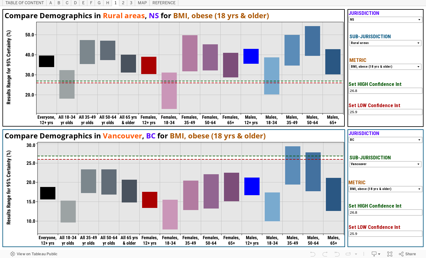
This dashboard shows rates for all demographics in a given sub-jurisdiction (or jurisdiction if All is chosen as a sub-jurisdiction), for a given metric, with confidence intervals.You can choose whatever values you like, along with a high low range represented by the dotted line. However, he idea was that you'd compare the same metric among two provinces, then set the high and low range to be equal or identical reference lines in both graphs, to see which demographics stand out, or how rates generally compared numerically, rather than the report cards that only showed the results in terms of dots. Values were present if you hovered your pointer over the dots, but you'd only be able see one result at a time, unlike these "rates" dashboards.
2
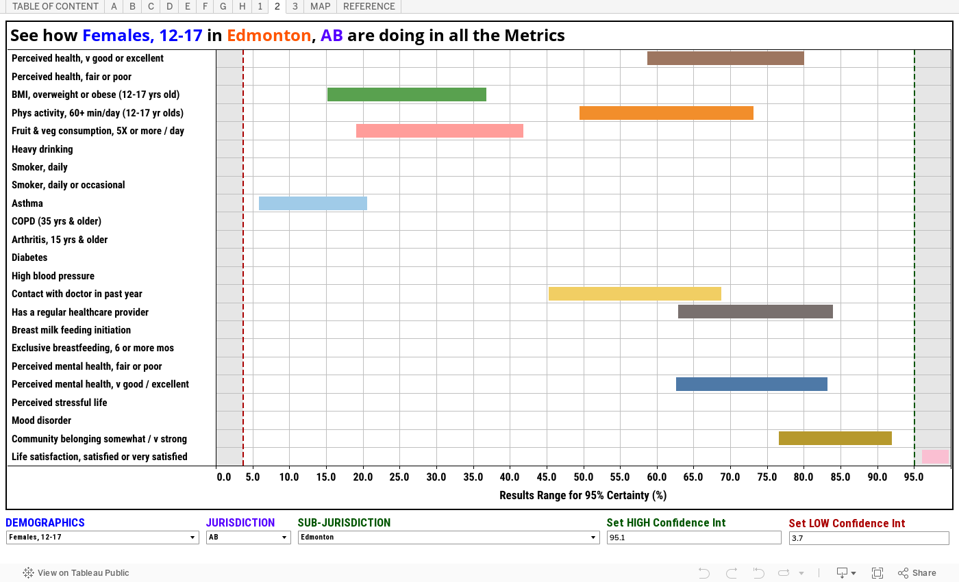
This dashboard shows the rates and confidence intervals for all metrics, of one demographic in one sub-jurisdiction (or jurisdiction if All were chosen for a sub-jurisdiction).
This dashboard gives a view of the relative difference among rates for all the metrics. It just shows which rates are high, and which are low, which can be useful for related topics like smoking, asthma and COPD, but it is not meant to imply causality.
3
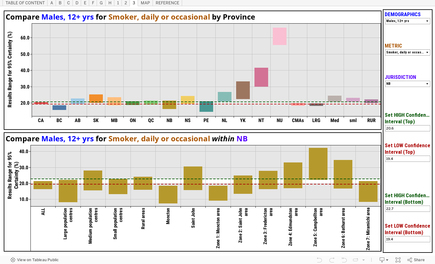
This dashboard shows different rates among the jurisdictions, then among all the sub-jurisdictions of one jurisdiction chosen, for one demographic on one metric.
It is a combined look at a jurisdiction as a whole, with its sub-jurisdictions. Looking at male smokers, notice the incredibly high rates in the territories! As for sub-jurisdictions in NB, not much really stood out. The confidence intervals are big enough that it's hard to say from this that there were much in terms of significant differences. That's why those report card style dashboards are so useful!
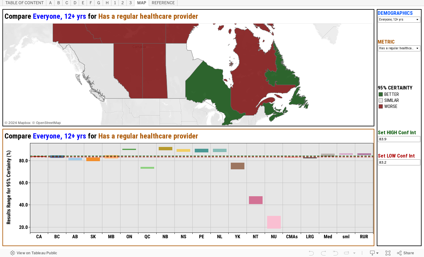
Map
The map dashboard is a combination of report card shown as a map with provinces coloured as their dot results would have been, at the top of the dashboard, and rates graph for the same indicator and group, at the bottom to show the numerical results of the report card comparisons in the map
In terms of having a regular healthcare provider, which is not the same as a regular doctor (a question that used to be asked in that format), the Atlantic provinces and Ontario are above the national average. Otherwise, QC is noticeably below the average, while NT and NU are doing horribly.
Please leave questions or comments below
That thankfully ends this post. I should have done this as one dashboard per post, but I didn't want people to have to roam around to find all the information.
This is my personal work and is not associated with any organization. If you found errors or have feedback, please let me know. I don't check this blog daily, but if I see questions, I'll do my best to answer them whenever I get the chance. Thank you and I hope you will find the tool I created to be helpful.
This is my personal work and is not associated with any organization. If you found errors or have feedback, please let me know. I don't check this blog daily, but if I see questions, I'll do my best to answer them whenever I get the chance. Thank you and I hope you will find the tool I created to be helpful.
If you want to see the individual year CCHS results for 2015 and 2016, including the latest results from 2016, but which is only available at provincial levels geographically, you can view them on this post.


Comments
Post a Comment